on
Analysis of Student-Teacher Evaluations
As part of a recent project, our team scraped, organized, and built a visualization platform for student-teacher evaluation data at our school, the University of Oklahoma. The data, scraped from a collection of publicly available pdf files, attempts to capture the students’ sentiment toward instructors and courses over the previous 10 years. With this extensive dataset, we have a unique opportunity to assess the legitimacy and potential biases in student-teacher evaluations, a topic that has been hotly contested in research. This blog post discusses the results of these analyses, exploring how student perceptions of teaching and courses correlate with gender, change with time, differ by college, and relate to the course-level.
Concurrently, we offer a thorough description of the methods used to investigate this dataset. Our investigation exploited two Python libraries for the data analysis tasks - pandas, a library used to manipulate and parse tabular datasets, and seaborn, a high-level statistical graphing utility based on the popular matplotlib. In addition, we used Jupyter Lab as a platform for integrating code, figures, tables, and markdown-based documentation into a structured “notebook” document. These methods, and the data used in the analysis, are presented in detail in an accompanying document, with the source code and dataset available in the attached zipped file.
Background on Student-Teacher Evaluations
Many research efforts have examined the efficacy, utility, and validity of student teacher evaluations, also known as student evaluations of teaching (SETs). Results are mixed, with some articles finding SETs provide necessary assessment of education from the student perspective, and others contending that biases within the dataset overwhelm any useful conclusions. Specifically, groups have found that SETs exhibited biases against female instructors, and substantial differences have been found between SETs from required versus elective courses. Despite the acknowledged shortcomings and biases in the dataset, a conclusion regarding the utility of SETs is offered by R. Remedios (2013):
Public universities like OU adopt this perspective when they administer SETs for internal evaluations of faculty and courses. Likewise, in building an app to allow students to easily access this data, my team and I expressed an implicit belief that SETs are a strong indicator of the quality of a course and instructor. However, prior to these investigations we did not know if this was a valid standpoint. For example, if investigations showed that the OU evaluations were correlated with factors other than the quality of the teaching and course, then we would have encouraged students to use bad data when making their enrollment decisions. Therefore, we wanted to investigate our thesis that SETs provide indications of the instructor teaching ability and the quality of the course.
Investigation Topics
Of the large number of potential contributors to SET outcomes, we elected to investigate the four topics below based on previous literature suggesting correlations with SET ratings:
- Biases in course ratings due to instructor gender
- Temporal differences in course ratings
- Disparities in student perceptions by college
- Dependence of student opinion on the level of the course (e.g., 1st-year vs graduate courses)
The following section will discuss the results in relation to similar studies in industry.
For further research about the effectiveness and validity of SETs, please see the following sources, or search for Student Evaluations of Teaching on Google Scholar:
Biases in Course Ratings Due to Instructor Gender
Because the original dataset provided by OU did not include instructor gender, gender predictions and confidence in gender predictions were obtained via the GenderAPI based on the instructor first name, and only included instructors with a 90% or greater gender prediction confidence. This enforcement shrunk our full dataset from 41039 course-sections to 36232 course-sections (11.7% decrease in data). Various threshold confidence levels were tested, with similar gender differences regardless of threshold. The distribution of ratings by instructor gender is shown in the plot below (Fig. 1).
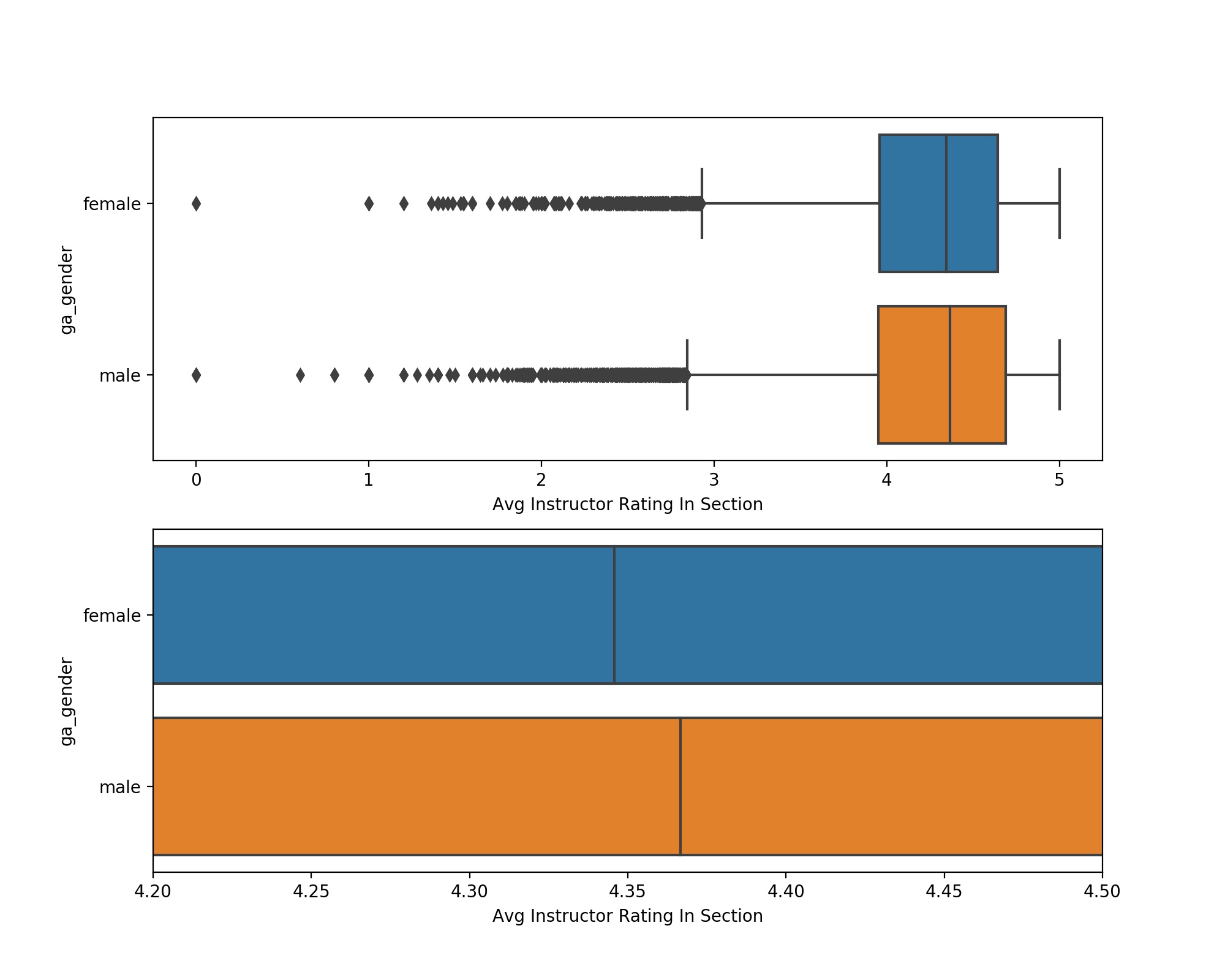 Figure 1: Plot showing the distributions of course ratings by instructor
gender. Note that the lower plot contains the same information, zoomed in on the
x-axis. Data included in Table 1.
Figure 1: Plot showing the distributions of course ratings by instructor
gender. Note that the lower plot contains the same information, zoomed in on the
x-axis. Data included in Table 1.
| Instructor Gender | Number of Courses Taught | Mean Rating | Median Rating | Standard Deviation around Mean Rating |
|---|---|---|---|---|
| Female | 13570 | 4.246 | 4.346 | 0.556 |
| Male | 22662 | 4.252 | 4.367 | 0.594 |
We note from Table 1 that men teach ~62% of the course-sections at OU, and that the mean scores between the average gender ratings are extremely similar (delta=0.006). A two-sampled independent t-test comparison between the course rating distributions revealed that the gender differences were not statistically significant (p=0.36). This result proves contrary to popular public perception of SETs, which views male professors as unjustly receiving higher ratings. Curiously, cursory searches of peer-reviewed literature failed to substantiate this belief, as evidenced by the following quotations, mainly obtained from article abstracts (Sidebar: thanks UC schools for fighting for open-access to journal articles):
“No gender main effects emerged” - Madera et al. 2010
“Few effects of gender were observed” - Reid 2010
“… teaching ratings are not affected by instructor characteristics (instructional experience, rank and gender)” - Liaw and Goh 2003
Still, some articles found gender differences - For example, Macnell et al. 2014 found that the gender of a professor contributed to a 10% difference in instructor rating. Tatro 1995 found that female instructors received higher ratings than male instructors. This variation in outcome is a known difficulty in psychological research, but it can be mitigated by considering a large sample size - such as the 36232 course-sections * 25.11 average students per course-section * ~5 questions per review = ~4.5 million data points considered in this study. With this massive dataset, another feature we can investigate is the temporal changes in instructor gender-specific distributions of course ratings. By viewing these yearly differences, the premise that male professors are higher rated is again unsubstantiated - although men have higher mean ratings in the majority of years, men were by no means consistently or exclusively rated higher than women (Fig. 2).
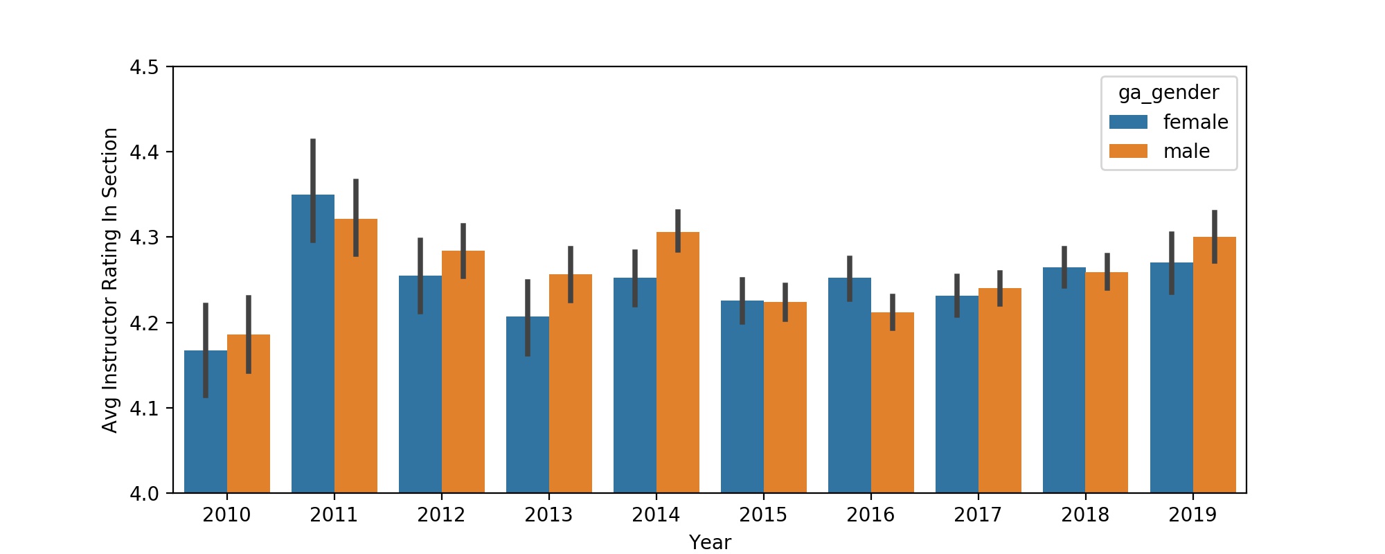 Figure 2: Plot showing the differences between male and female course
ratings by year. Data included in Table 2.
Figure 2: Plot showing the differences between male and female course
ratings by year. Data included in Table 2.
| Year | 2010 | 2011 | 2012 | 2013 | 2014 | 2015 | 2016 | 2017 | 2018 | 2019 |
|---|---|---|---|---|---|---|---|---|---|---|
| Female Instructor Average Rating | 4.167 | 4.350 | 4.255 | 4.207 | 4.252 | 4.226 | 4.252 | 4.231 | 4.265 | 4.27 |
| Male Instructor Average Rating | 4.186 | 4.321 | 4.284 | 4.257 | 4.306 | 4.224 | 4.212 | 4.24 | 4.259 | 4.301 |
Despite the breadth of courses considered in this investigation and the lack of explicit gender bias found, it's entirely possible that unconsidered variables could have been masked by our aggregate analysis. For example, bias in *instructor gender* may be dependent upon the *student gender*, which we are unable to assess with the present dataset. Despite these potential confounders, which no contained statistical argument could fully refute, we are comfortable with the level of gender differences in the dataset presented on our app. We encourage interested parties to download the dataset and perform further analysis if interested ([dataset](https://ou.evals.info/2019-10-06-Aggregated-Reviews.csv)).
Differences between Colleges
Another potential contributor to differences in student evaluations is the college offering the course. Qualitatively, there are differences between the personalities, expectations, and sentiments of students within the different colleges. However, do these collegiate differences in student populations inspire different evaluations of teaching? The answer seems to be a yes (Fig. 3).
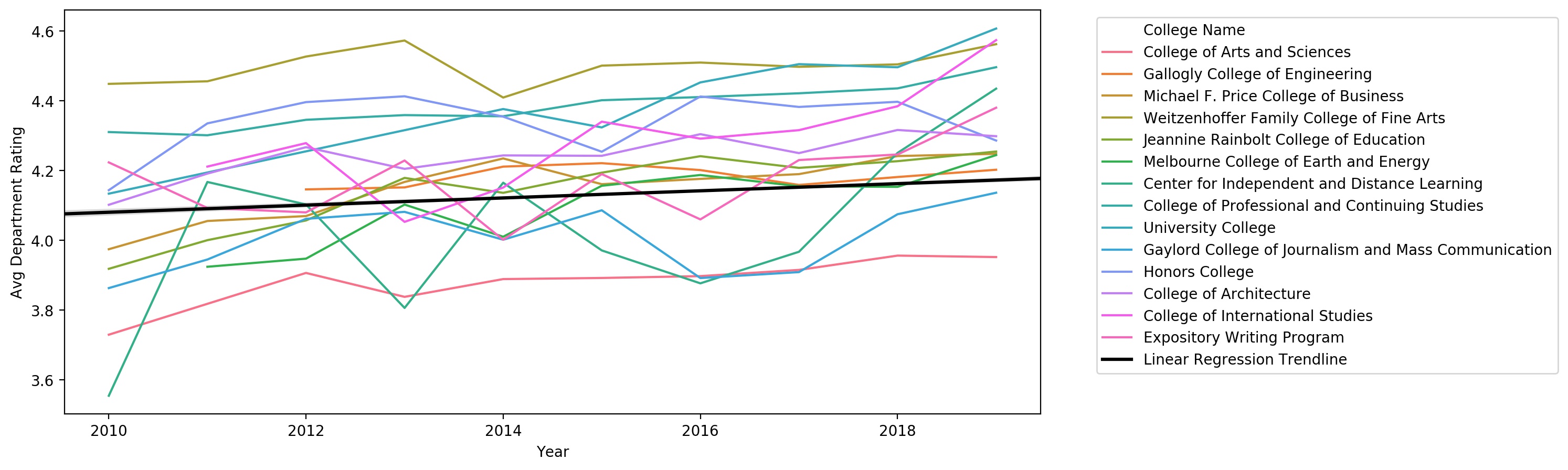 Figure 3: Time-series plot showing the average course rating of each college
at OU. Regression line was computed via ordinary least-squares. Data included in
Table 3.
Figure 3: Time-series plot showing the average course rating of each college
at OU. Regression line was computed via ordinary least-squares. Data included in
Table 3.
Although the plot in Figure 3 shows that ratings are highly variable by college, it’s very difficult to discern individual college ratings on this plot, and further challenging to correlate the college rating with its size. For these investigations, note the data presented in Table 3 and Figure 4.
| College Name | Number of Courses in College | Avg Rating of Courses in College |
|---|---|---|
| Center for Independent and Distance Learning | 2 | 4.280 |
| Expository Writing Program | 79 | 4.184 |
| University College | 88 | 4.442 |
| College of International Studies | 171 | 4.332 |
| Melbourne College of Earth and Energy | 220 | 4.129 |
| Honors College | 262 | 4.349 |
| Gaylord College of Journalism and Mass Communication | 267 | 3.996 |
| College of Professional and Continuing Studies | 378 | 4.389 |
| Michael F. Price College of Business | 405 | 4.188 |
| Gallogly College of Engineering | 508 | 4.186 |
| College of Architecture | 560 | 4.253 |
| Jeannine Rainbolt College of Education | 561 | 4.186 |
| Weitzenhoffer Family College of Fine Arts | 1133 | 4.484 |
| College of Arts and Sciences | 2898 | 3.923 |
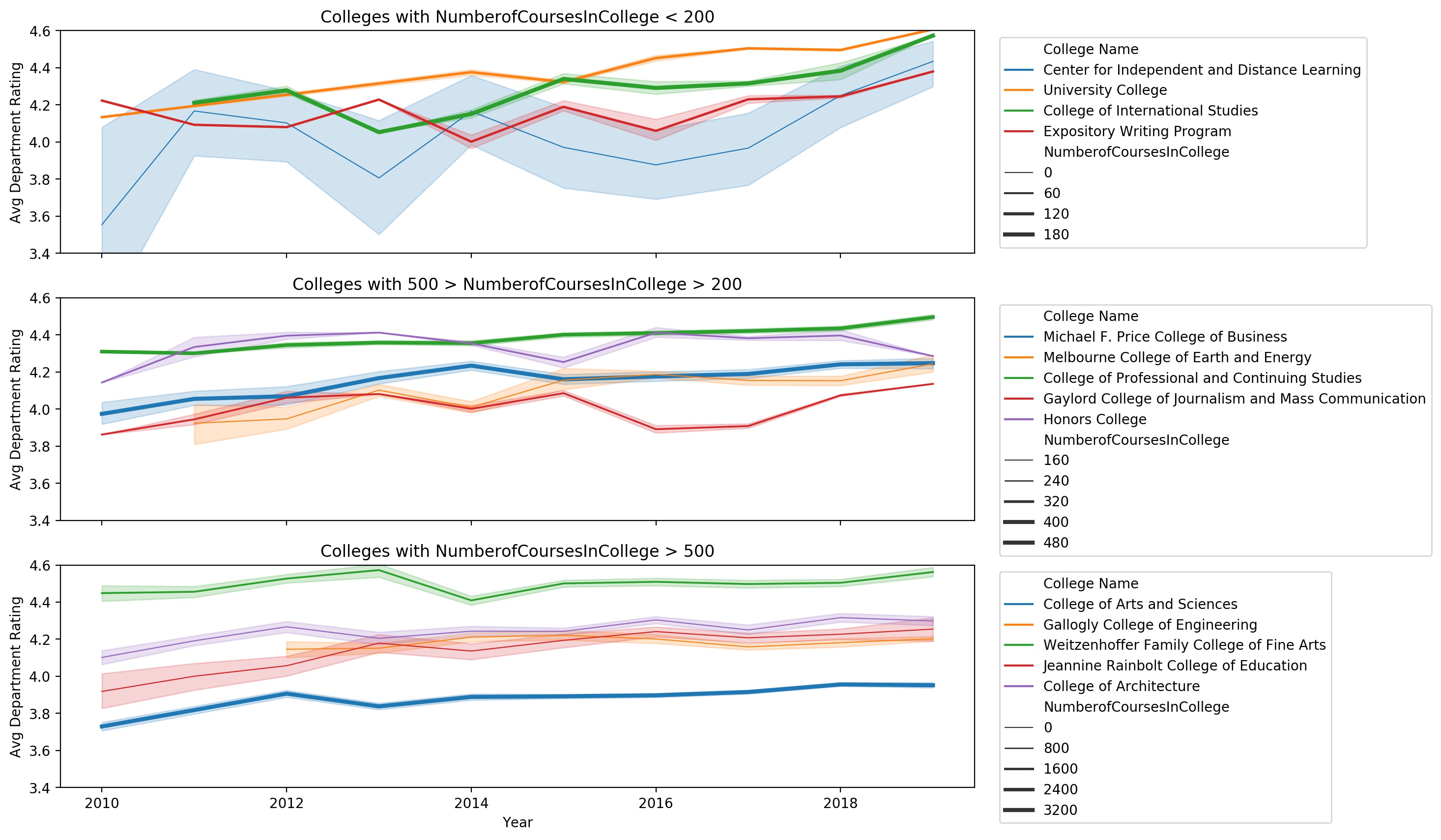 Figure 4: Time-series plots illustrating the average course ratings of each
college at OU over the previous 10 years. Panels are arranged by the number of
courses presented in each college, where larger colleges are presented in the
bottom panel, and colleges offering fewer courses are presented in the top
panel.
Figure 4: Time-series plots illustrating the average course ratings of each
college at OU over the previous 10 years. Panels are arranged by the number of
courses presented in each college, where larger colleges are presented in the
bottom panel, and colleges offering fewer courses are presented in the top
panel.
Based on cursory literature search, few existing articles have examined the variation in student reviews as a function of college/department. More typically, as in the article by Johnson et al. 2013, a study selects a single college and collects/analyzes data exclusively from that source. With these approaches, it’s difficult to gain a comprehensive understanding of the demographic trends in student evaluations, because as we see in Figs. 3-4, the average course rating is strongly dependent upon the college in question. It’s entirely reasonable to suspect that other correlations or biases, such as instructor gender, course level, or course enrollment, could depend upon college. Further groups are encouraged to pursue these analyses if interested. In the meantime, to encourage students to account for the college/departmental differences in our app, we’ve included a department tag indicator associated with each instructor in our app, to show which department the instructor has taught within and therefore which similar instructors he/she might logically be compared with.
A curiousity that arose from this analysis was the overall temporal trend in course/instructor ratings. It turns out that grade inflation may be a quid-pro-quo, as instructor ratings have risen by on average 0.010 per year over the 10 year period shown in Fig. 4 (p~0).
Course Level and Course Enrollment Effects
Many previous studies have noted a correlation between the level of the course (e.g. first-year vs graduate) and the course rating (Boring et al. 2016, Johnson et al. 2013). We investigated these differences within our dataset (Fig. 5).
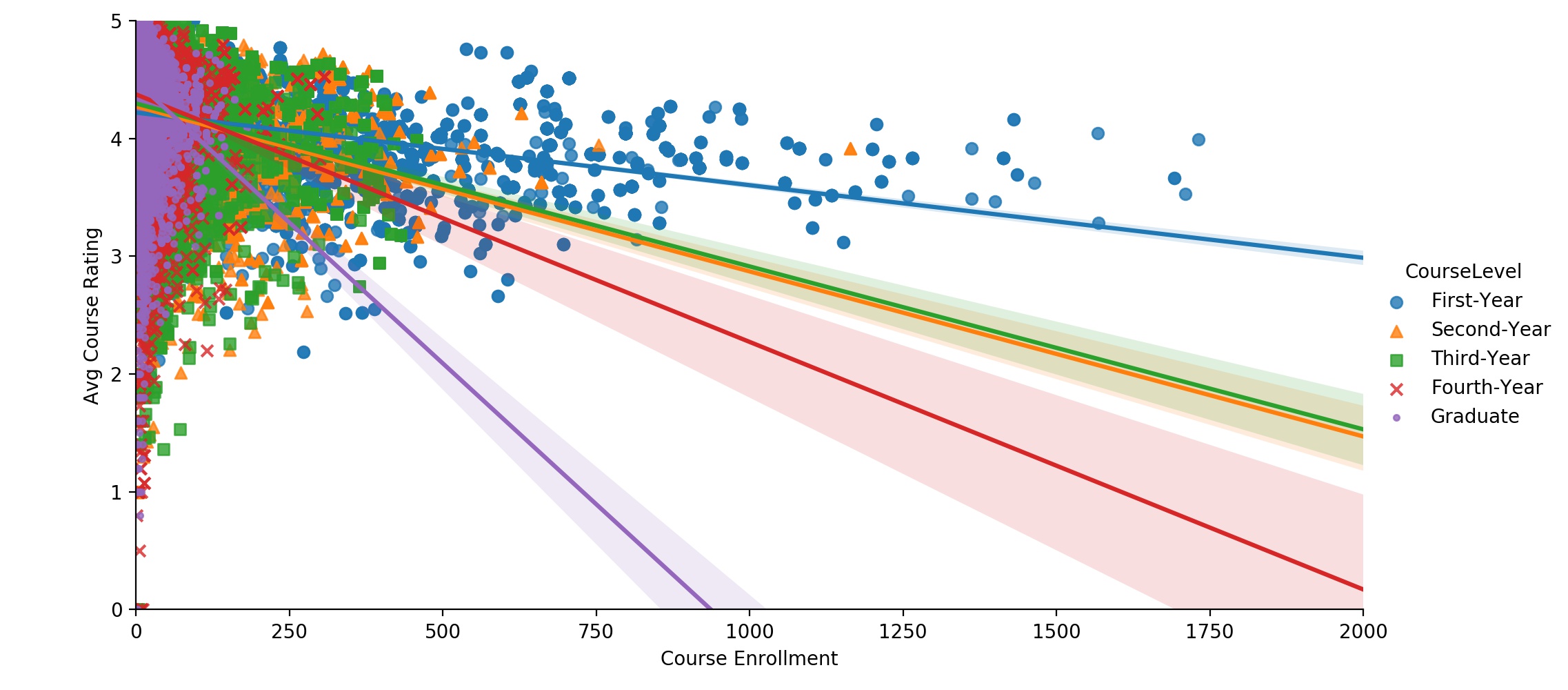 Figure 5: Scatterplot showing the relationship between course rating and
course enrollment for each course level. Lines show least-squares regression for
each course level. Lighter-shaded regions around regression lines indicate 95%
regression lineconfidence interval.
Figure 5: Scatterplot showing the relationship between course rating and
course enrollment for each course level. Lines show least-squares regression for
each course level. Lighter-shaded regions around regression lines indicate 95%
regression lineconfidence interval.
The plot above highlights the negative correlations between average course rating and course enrollment within each course level. In other words, regardless of the level of the course, the smaller courses tend to have higher ratings. Another way to visualize this relationship is to consider the physical meaning of these data points. The various points in Figure 5 represent the massive first and second-year courses taught in expansive lecture halls, the highly-intimate, interactive, and targeted graduate classes, and every course in-between these two extremes. Regardless of which category a specific course falls into, the regressions illustrate an important finding - students give lower ratings to larger courses.
Additionally, we see that the first-year courses tend to have the highest enrollment, and that the average course enrollment appears to decrease as the course level increases. The distributions of course sizes within each course level are further explored graphically in Figure 6 and textually in Table 4.
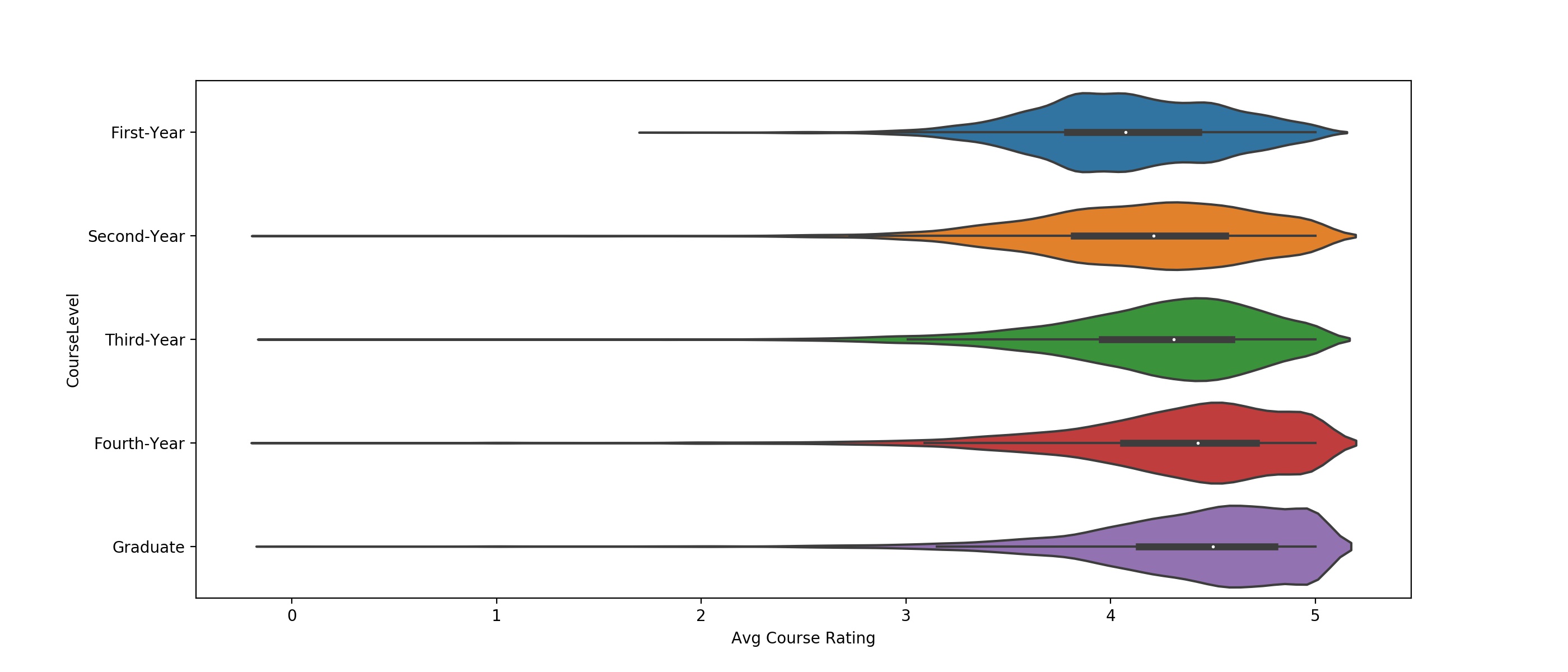 Figure 6: Violinplots showing the average course rating for each course
level. Within each violin, white dots represent the median ratings and thicker
horizontal bars show IQR, while thinner horizontal lines show 1.5*IQR, as in a
box-and-whisker plot.
Figure 6: Violinplots showing the average course rating for each course
level. Within each violin, white dots represent the median ratings and thicker
horizontal bars show IQR, while thinner horizontal lines show 1.5*IQR, as in a
box-and-whisker plot.
| Course Level | Mean Course Rating | Q1 Course Rating | Median Course Rating | Q3 Course Rating | Mean Course Enrollment | Median Course Enrollment |
|---|---|---|---|---|---|---|
| First-Year | 4.085 | 3.789 | 4.074 | 4.429 | 219.331 | 101 |
| Second-Year | 4.154 | 3.822 | 4.211 | 4.560 | 84.586 | 40 |
| Third-Year | 4.225 | 3.957 | 4.309 | 4.590 | 51.913 | 32 |
| Fourth-Year | 4.317 | 4.062 | 4.427 | 4.711 | 27.646 | 19 |
| Graduate | 4.396 | 4.140 | 4.500 | 4.800 | 18.265 | 11 |
Clearly, there is a strong correlation between the level of the course and the average course rating, with median course ratings increasing from 4.08 to 4.50 from the first-year to the graduate course level (R2 = 0.0456, p~0). However, there is a confounding correlation between course level and course enrollment, with median enrollment decreasing from 101 students in first-year courses to 11 students at the graduate course level (R2 = 0.1940, p~0). Due to the higher R2 value, we conclude that the course enrollment is a stronger contributor to the observed differences in mean student ratings than the course level, but that both course level and course enrollment/course size are significant contributors to differences in student ratings. To make our app’s users better aware of these contributing factors, we have included an explicit tag on each course stating the level of the course (although this information is implicit from the course number). We’ve also included a pie-chart showing the course enrollment breakdown by instructor for the most recent semester that the course was offered. We expect that these two inclusions will help students to make better informed comparisons across courses and to recognize these differences between courses.
Conclusions
The results of our analyses for the OU student reviews dataset are summarized in the following assertions: (i) No significant differences in course ratings were found between male and female instructors, (ii) course ratings showed a minor year-to-year increase, with average course ratings approximately 0.10 points higher in 2019 than in 2010, (iii) Average course reviews varied by college, but these collegiate differences were not dependent upon the number of courses offered by the college, (iv) Course ratings were dependent upon the course level, with ratings on average 0.5 points higher for graduate courses than first-year courses, although much of this difference could be attributed to the larger course enrollments within the first-year compared to the graduate courses.
We believe the features we have included in our website (mentioned throughout the text), combined with the disclaimer popup shown below (taken from website), help to inform students about the factors other than the quality of the course or instructor which may cause differences in ratings.
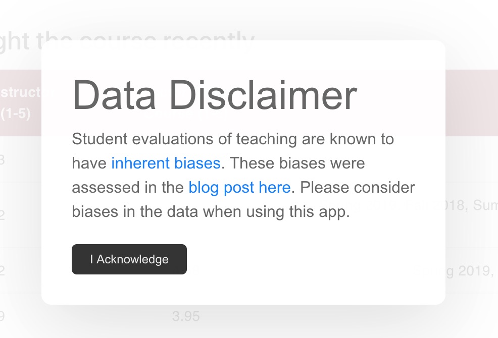
Note that the “blog post here” link in the above image sends the viewer to this blog post.